If your work life is virtual, you know that your website is the glue that holds your entire business together. It’s the thing your customers go to when they want to get to know you. Before they know for a fact that they want to work with you, they go to your website – and they’re looking for your sales page for your latest course or program. Your sales page can be THE most important page on your website, so you want to make sure that it’s a high-converting one. Meaning – your sales page turns window shoppers into loyal paying clients!
So, how do you know you have an effective sales page?
Pull up your sales page right now and see if you have these 7 highly effective elements. If you have all 7, congratulations! You’re on track for a high-converting sales page. If you’re missing a few things, take a note of what they are so you can update them on your CEO day. Or you could delegate this task to your Tech VA. Either way, by adding these elements to your sales page you’re sure to attract more loyal clients.
1) A Colorful and Dynamic Mockup Of Your Digital Offer
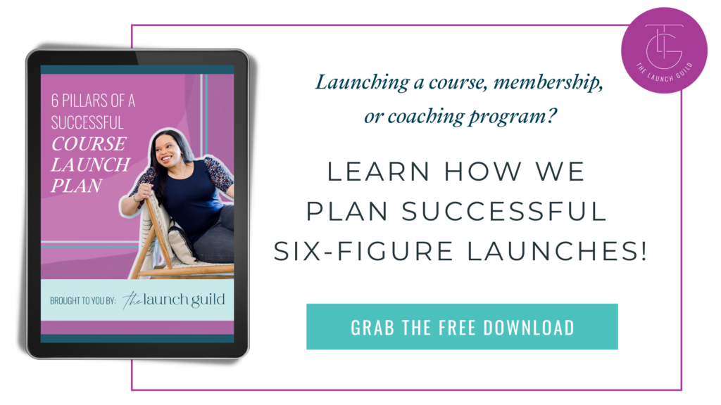
Some people need to see it to believe it – so give them a sneak peek! Let them see what’s waiting for them inside your course by giving them a visual. A “mockup” is a graphic showing your course logo, components, or even your face on a video call, typically displayed on devices like laptops and phones. You can also show examples of PDFs or companion workbooks. Here’s one of our past course mockups:

Having something visual for your clients to see makes you and your offer more tangible. We want to make it easy for your clients to envision all that they’ll gain and experience when they purchase your course. If you want a high-converting sales page, make sure you visually show your client all the things they’ll get in your offer.
2) Clear Pricing Options For Pay in Full and Payment Plans
Take a look at your sales page. Do you have multiple payment options? Do people save money when they pay in full or can they get started on a no-brainer plan? Having different payment options can help you attract more clients by working with their budgets. Not everyone can afford you right away, but some can. You want to make the payment process as easy as possible so they don’t have to think twice about working with you.
And don’t forget to display your prices with confidence! Make sure your pricing is bold and clear to the sale page visitor. Don’t hold back on sharing exactly what the offer costs and what they get at various pricing levels.
3) Share ALL the Details on Your Bonuses
Your bonuses are the cherry on top of an already amazing offer. Make sure your future clients know about the cherries! 🍒
Your core content is already incredible but these bonuses make your clients’ experiences even better. Highlight how these awesome bonuses complement your offer. And remind them if certain ones are only available for a certain time (a fast action bonus). These kinds of elements can help move those fence-sitters into action mode.
Or you could couple a bonus with a certain payment option (like a Pay-in-Full bonus). Exclusive perks go a long way so if there’s a juicy incentive for those who pay for your course upfront, you want that to be loud and clear on your sales page. Clients are delighted when they feel like they got more than they paid for. Highlighting your amazing bonuses can make for a high-converting sales page by turning the purchase into a no-brainer for your ideal clients.
4) Juicy Testimonials
If you’ve ever looked up the Yelp reviews of a restaurant, you know why this is important. Your clients are entrusting you with their money, their time, and their commitment to your program’s process so that they can get their desired results. They want to know they’re making a worthy investment and testimonials are the best way to give them that clarity.
Besides quotes from your clients, which you should always have on your site, share any screenshots you have from any recent email, social media posts, and personal DMs. This provides great social proof that your clients are willing to back you.
5) FAQ Section
Not only will this section give your future clients the clarity they’re looking for, but it’ll also save you a TON of time answering the same questions over and over again. And this section can be super easy to build on your website. Even the simplest questions may just need a straight answer.
There’s likely a LOT of information all over your sales page but if you can distill your potential customers’ biggest questions down to one section so it’s all in one place (even if it feels repetitive). It’s a great spot for them to get info all in one place.
Common questions I’ve seen include:
- When does the program start?
- How long do I have access?
- What if I’m {blank}, is this still right for me?
- What is your refund policy?
See if you can add any of these to your sales page. And if there are any FAQs unique to your business that you can add.
6) A Countdown Timer
This is perfect if you have programs that require you to be there and teach live in front of an audience. That way everyone knows when to be registered and when to show up. A timer makes it clear to your clients that they shouldn’t wait and take action.
Many web page builders now have countdown timers built-in to their software so you may be able to just turn one on and go! However, if you need an outside tool, check out Deadline Funnel.
7) A Live Chat Option
Feeling extra fancy? Check out Drift. It’s a free online tool that allows you to place a live chat right on your sales page so that you can answer customer questions. Some people need that one last-minute question answered before they commit. If you’re there to answer it for them and they sign up for your program, you’re that much closer to having a high-converting sales page.
A clear and effective sales page is key to selling any course, coaching program, or digital product. Take a look at your sales page one more time. What are some key elements that could be included on your sales page to make sure it converts?
One last thing: take a screenshot of your current conversion rates and come back to those numbers in six months or after your next launch, once all your tweaks have gotten a test drive. You’ll wanna see how much you’ve grown. 😊
Whether this is your 1st launch or your 100th, we want to make sure you don’t make any all too common mistakes. That’s why I’ve made this video detailing the most common mistakes I’ve seen first-time launchers make
“4 Mistakes Coaches and Course Creators Make as They Scale their Launches”
This FREE video is more than a few tips and tricks. These are structural changes you can make during your launch so you’re not scrambling to clean up after any preventable mistakes.
~
The Launch Guild is all about making course creators like you feel good about your launches while amplifying your impact. If you’d like to book one of our launch services for your next launch, schedule your complimentary consultation!

More Posts to Love!
4 Mistakes Coaches & Course Creators Make As They Scale Their Launches
Watch This Free Video Now:

watch now


